Case Study:
Integrated Marketing & Branding
Refreshing A Brand With a 35-Year Legacy
Advanced Geosciences, Inc.
My Contributions:
Creative Direction
Brand Strategy & Design
Web Design & Development
Copy Writing
Video Production
The Team:
VP Operations
1 Webflow Developer
Tools:
Adobe Creative Cloud
Relume
Figma
Webflow
The Problem
In 1989, Advanced Geosciences, Inc. introduced a business-grade device that revolutionized the geophysical exploration industry.
I’ll spare you the more technical details, but their device could automatically take hundreds of scans across a long distance of land to see what is beneath the surface. Their product significantly improved the then-standard practice of one manual scan per ten minutes and moving all equipment a few meters to the subsequent scanning location.
It was like introducing an MP3 player to a market that was used to cassette tapes. This device transformed the industry for the next thirty-five years.
Over the next three decades, new competitors emerged—some of which had sleeker and more modern branding than Advanced Geosciences. As the company prepared to disrupt the market again in 2024 with its next line of products—it was apparent that its branding needed a refresh to match the spirit and direction of its upcoming offerings.
This crossroads presented a perfect opportunity to address website problems affecting the brand’s image:
Some prospects don’t clearly understand that the company is a manufacturer and may miscategorize it as a service provider.
Crucial information is overlooked, resulting in support tickets.
Some information is obfuscated, robbing qualified leads of accurate information to aid their decision-making processes.
Along with the rebrand, the website desperately needed a complete revamp to enhance user experience, offer captivating content, and encourage potential clients to contact sales representatives.
The Approach
At the start of this project, I had the benefit of not having to do market research. I already had intimate knowledge of the brand, the industry, competitors—and had first-hand experiences with their target audience. I’ve heard praise and complaints and knew that a simple logo refresh was insufficient to address the brand’s issues.
I needed to put the “Advanced” back into Advanced Geosciences. But I had to take things one step at a time.
As Tony Montana would put it:
“First, you get the branding, then you get the website, then you get the clients”
The Branding
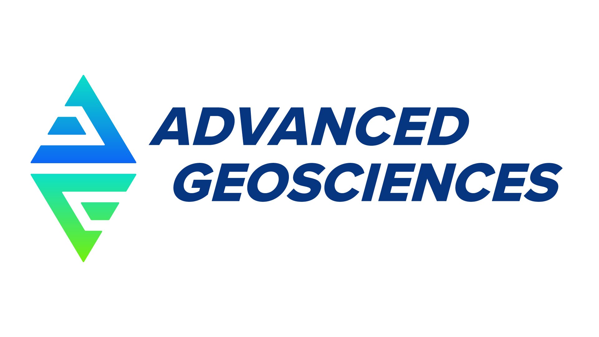
Refreshing the logo had anticipated side effects. Several products had unique logos. Aligning these with the new direction was imperative. The new logo would serve as the guiding light for everything to come.
My vision for the logo was to create a design that captures the essence of earth-based science and technology while being modern. I wanted to keep the brand’s familiar colors but give them a refreshed vibrancy and coherence.
I removed the world map since global reach wasn’t central to the brand’s identity. Instead, I focused on elements that conveyed durability, trust, and technology. I also removed “Inc.” to make the brand feel less formal.
An emphasis on durability led me to select a weightier font to replace the thin sans-serif style of the previous logo.
I deliberately incorporated a diamond icon in the design to offer a modern interpretation of the company’s initials—using a shape that invokes quality. The strategic use of negative space imbues the logo with technological sophistication.
The shapes within the design subtly evoke the appearance of geophysical data, reinforcing the brand’s connection to analytical precision.
Branding Challenge
Two of the company’s products had their own logo—including their flagship device, the “SuperSting.” For a cohesive brand, both products would require a redesign.
The company is most famous for the SuperSting. The previous logo integrated a bee, which had to be incorporated into the new branding. My new core logo worked nicely into the shape of a bee, and I snuck in a fun easter egg of an arrow pointing down (since the device is used to see beneath the surface).
EarthImager is the company's proprietary data processing software. Again, the core logo integrated nicely into the refresh since data is plotted on a chart and predominantly takes the shape of an isosceles trapezoid.
The Website
I would love to say that updating the website meant swapping out some button colors and the logo in the main navigation bar. But alas, the challenge was far greater.
The company’s website was hosted on a version of Drupal that was about to be discontinued. I migrated the website from Drupal to Webflow for budgetary and logistical reasons.
Was this a wise decision? Yes. Was it more work than expected? Also yes.
But this was an opportunity to build the framework from the ground up instead of giving the Drupal site a fresh coat of paint.
Engage, Educate, and Empower.
That was my mantra during the design process for the website. Incorporating engaging interaction, product photos, and breaking up information into digestible chunks would help users absorb information.
Engage
Subtle animations, more images, and easier navigation will improve engagement and session metrics. Additionally, I would make more room for the content that speaks to the audience the most.
Educate
I made a conscious effort to introduce customer testimonials and make case studies more prevalent throughout. Additional details about products were added to solve the problem with obfuscation.
Empower
Through engagement and education, qualified leads will be empowered with the confidence to start the conversation on their terms. The goal was to build trust with potential clients and strengthen our relationship with current clients.
Website Challenges
Dozens of pages required my attention, and the clock was ticking down to the Drupal site’s end of life. As the only designer on the team, I needed to keep things as efficient as possible.
I used Relume to wireframe pages quickly using industry-standard and responsive layouts. Relume also allowed me to keep things efficient by integrating wireframes into Figma for design and Webflow for building.
While I could handle wireframing and design, I needed the most help with the build. I expected this, so I made a concerted effort to squirrel away most of my budget to hire a freelance Webflow developer.
Results
The company was delighted to have found a new branding direction that was both fresh and modern, which perfectly aligned with the SaaS product they were introducing to their hardware offerings.
The website had quality-of-life improvements that the audience had requested for years, including better navigation and easier-to-follow information. Below is a side-by-side example of the product page for the SuperSting™.
The website and the new branding will launch in Q4 of 2024.
Product Page Comparison
Previous Version
Redesign
Ok, let me show you some other cool stuff
B2B Marketing
Advanced Geosciences
Conversion Generation
B2C Marketing
Disney/Pixar “The Good Dinosaur”
iTV Experience


